Stop Making These 7 UX Mistakes (That Are Killing Your Brand)
Brand Reputation and User Experience (UX)
Poor user experience (UX) can significantly damage brand reputation, alienate customers, and lead to lost revenue. This guide aims to identify common UX mistakes, address user frustration, improve conversion rates, and boost customer satisfaction and loyalty.

Good Intentions Don’t Save Bad Design
You hired talented designers. You invested in a beautiful color palette. You even bought that premium font license. And yet — users are bouncing, conversions are flat, and your support inbox is overflowing with people who simply can’t find the button.
Here’s the uncomfortable truth: most brands don’t fail at design because they don’t care. They fail because they care about the wrong things. They chase trends instead of clarity. They design for stakeholders instead of users. They polish surfaces while the foundation crumbles underneath.
The result? A product that looks like a million dollars but feels like a maze.
I’ve spent years studying what separates digital experiences that delight from those that frustrate, and the patterns are strikingly consistent. Below are seven of the most common — and most damaging — UX mistakes I see brands make repeatedly. The good news? Every single one is fixable.
Mistake #1: Prioritizing Aesthetics Over Usability
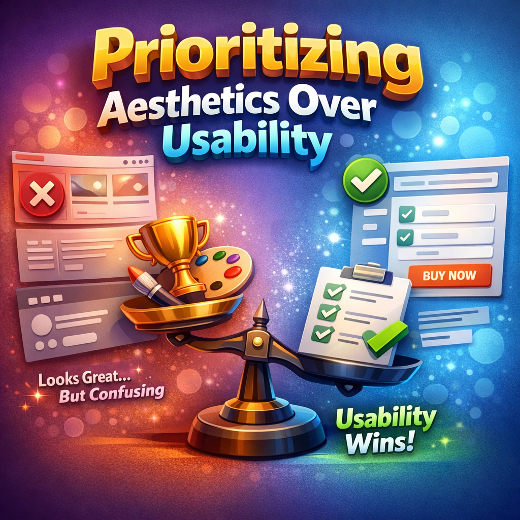
This is the cardinal sin, and it’s everywhere.
A landing page with white text on a light gray background. A navigation menu that disappears behind an abstract icon no one recognizes. A checkout flow that looks stunning in a Dribbble shot but requires a PhD to actually complete.
The seduction of aesthetics is powerful. Beautiful design feels like good design. But beauty without function is decoration — and decoration doesn’t convert, retain, or build trust.
“Design is not just what it looks like and feels like. Design is how it works.” — Steve Jobs
The brands that win understand that usability is the aesthetic. A clean, intuitive interface where every element serves a purpose — that’s beautiful. A form that takes 30 seconds instead of three minutes — that’s gorgeous. When users can accomplish their goals without friction, the design becomes invisible in the best possible way.
The shift: Before asking “does this look good?” start asking “does this work well?” Visual appeal should amplify usability, never compete with it.

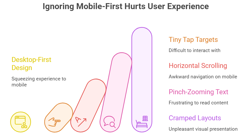
Mistake #2: Ignoring Mobile-First Design
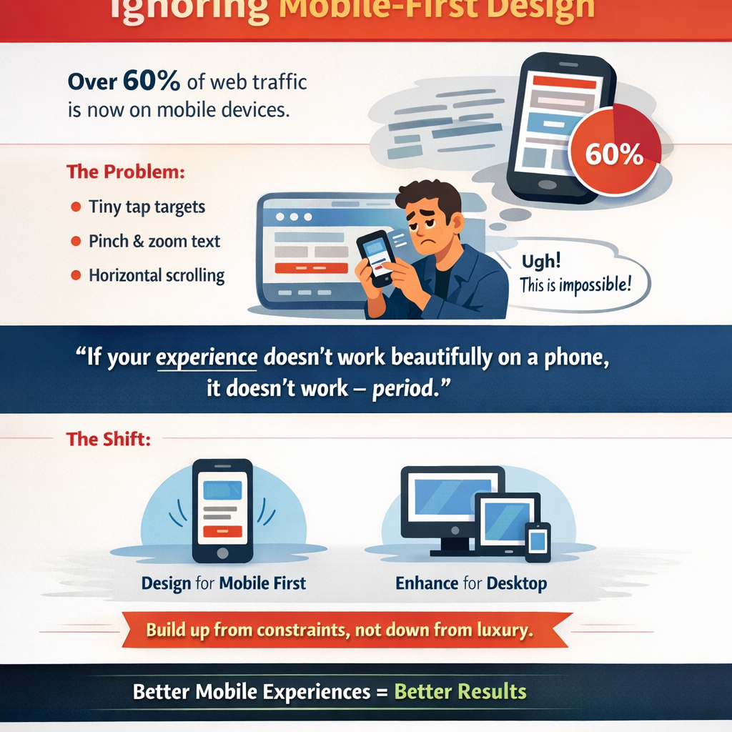
We’re well past the point where mobile optimization is optional. Over 60% of global web traffic now comes from mobile devices. And yet, an astonishing number of brands still design for desktop first and then squeeze the experience down to a smaller screen as an afterthought.
The result is predictable: tiny tap targets, horizontal scrolling, text that requires pinch-zooming, and layouts that feel like someone crammed a king-size mattress into a studio apartment.
But mobile-first isn’t just about screen size. It’s a design philosophy. It forces you to prioritize ruthlessly. When you only have 375 pixels of width to work with, you can’t hide behind sprawling layouts and decorative filler. Every element has to earn its place.
“If your experience doesn’t work beautifully on a phone, it doesn’t work — period.”
The shift: Start your design process on the smallest screen. Build up from constraint, not down from luxury. You’ll find that the discipline of mobile-first thinking actually makes your desktop experience stronger too.
Mistake #3: Cluttered Visual Hierarchy

This mistake shows up as pages crammed with competing headlines, multiple calls to action fighting for clicks, bold colors splashed across every section, and content blocks that blur together into visual noise. The user’s eye lands on the page and immediately asks: where do I look first?
If your design can’t answer that question in under two seconds, you have a hierarchy problem.
Visual hierarchy is the silent architecture of great design. It guides the eye, establishes importance, and creates a rhythm that feels effortless to follow. Size, color, contrast, whitespace, and positioning — these are your tools. And the most powerful one is often the most underused: whitespace.
Whitespace isn’t wasted space. It’s breathing room. It’s the pause between notes that makes the music.
The shift: Practice radical prioritization. For every page, identify the one thing you want the user to do or understand. Design everything else in service of that single goal. Remove elements until it hurts — and then remove one more.

Mistake #4: Confusing Navigation
Navigation is the skeleton of your digital experience. When it’s broken, everything collapses.
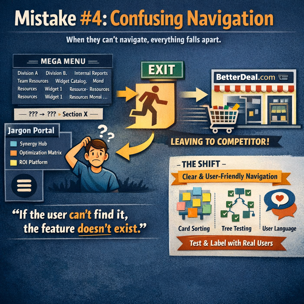
Confusing navigation takes many forms: mega-menus with 47 options organized by internal department structure instead of user intent. Hamburger menus on desktop that hide critical pathways. Breadcrumbs that don’t actually tell you where you are. Labels written in company jargon that mean nothing to an outsider.
The root cause is almost always the same — the navigation was designed around how the organization thinks, not how the user thinks.
“If the user can’t find it, the feature doesn’t exist.”
This is particularly lethal for e-commerce and SaaS brands, where a single moment of navigational confusion can send a potential customer straight to a competitor. Studies consistently show that users who struggle with navigation are significantly more likely to abandon a site entirely rather than try to figure it out.
The shift: Use card sorting and tree testing with real users to validate your information architecture before you design a single pixel. Label things in your users’ language. And never make someone think about where to click next — make it obvious.
Mistake #5: Not Solving the Real Problem
This is the most insidious mistake on the list because it often masquerades as productivity.
Teams build features, redesign interfaces, and launch campaigns without ever pausing to ask a deceptively simple question: what problem are we actually solving, and for whom?
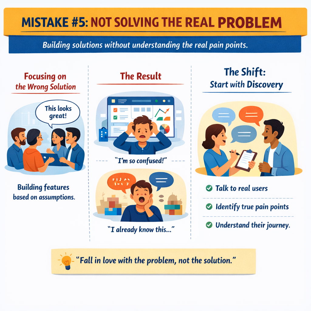
The result is a beautifully designed solution to a problem nobody has. A feature-rich dashboard that overwhelms the very users it was built for. An onboarding flow that explains things users already understand while ignoring the thing that actually confuses them.
This mistake stems from assumption. Teams assume they know what users need based on internal logic, competitive analysis, or the loudest voice in the meeting room. But assumptions are not insights. Insights come from observation, research, and genuine empathy.
“Fall in love with the problem, not the solution.”
The shift: Before designing anything, invest time in discovery. Interview real users. Map their journey. Identify the actual pain points — not the ones you assume exist. The most elegant UX work often starts not with a wireframe but with a conversation.

Mistake #6: Skipping User Testing
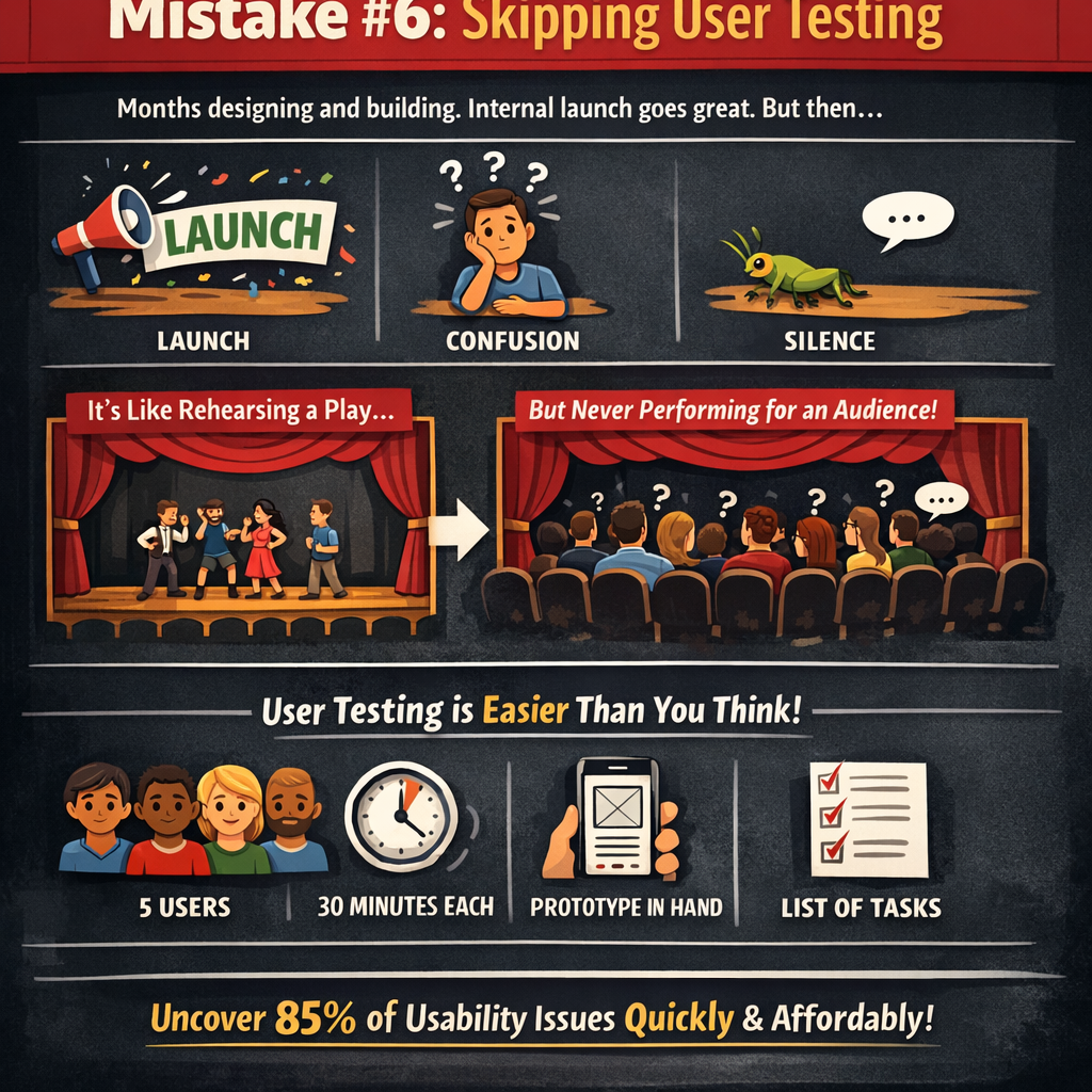
Here’s a scenario that plays out in organizations every single day: a team spends months designing and building a product. They present it internally. Leadership loves it. It launches. And then — silence, or worse, confusion.
The product fails not because the team lacked talent but because they never let a real user touch it before launch.
Skipping user testing is like rehearsing a play and never performing for an audience. You might think the story is clear, but you have no idea where the audience gets lost, bored, or frustrated until you actually watch them experience it.
And here’s the thing — user testing doesn’t have to be expensive, time-consuming, or formal. Five users. Thirty minutes each. A prototype and a list of tasks. That’s enough to uncover roughly 85% of usability issues, according to decades of usability research.
“You are not your user. You never were, and you never will be.”
The patterns that emerge from watching real people interact with your design are humbling and invaluable. Buttons they don’t see. Language they don’t understand. Flows that seem logical to your team but feel utterly backwards to everyone else.
The shift: Build testing into every phase of your process, not just the end. Test early with rough sketches. Test mid-process with interactive prototypes. Test post-launch with analytics and session recordings. Make user feedback a habit, not an event.
Mistake #7: Inconsistent Design Language
Inconsistency is a silent brand killer.
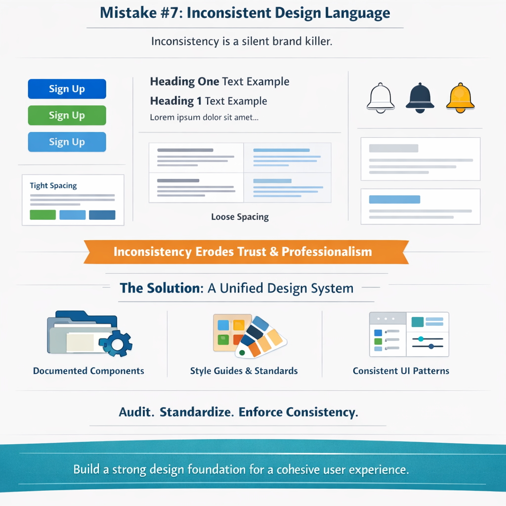
It shows up as a button that’s blue on one page, green on another, and a slightly different shade of blue on a third. Typography that shifts between screens for no apparent reason. Iconography that mixes styles — outlined here, filled there, illustrated somewhere else. Spacing that feels tight in one section and loose in the next.
Each individual inconsistency might seem trivial. But cumulatively, they erode trust. They make a brand feel disjointed, careless, and unprofessional — even if no user could consciously articulate why something feels off. They just feel it.
Design systems exist to solve this exact problem. A well-maintained design system — complete with documented components, tokens, patterns, and usage guidelines — ensures that every touchpoint, every page, and every interaction feels like it belongs to the same family.
The shift: Invest in a living design system and treat it as product infrastructure, not a side project. Audit your existing interfaces for inconsistencies. Establish clear rules for color, type, spacing, and component behavior — and enforce them. Consistency isn’t about restricting creativity; it’s about building a foundation from which creativity can flourish with coherence.
The Fix: How to Combine Visuals, UX & Problem-Solving
If these seven mistakes share a common thread, it’s this: they all stem from a fragmented approach to design.

Aesthetics, usability, and problem-solving aren’t three separate disciplines. They’re three lenses on the same work. The brands that create truly exceptional digital experiences understand that:
- Visuals create the emotional connection and first impression.
- UX creates the functional pathway that turns interest into action.
- Problem-solving ensures the entire effort is anchored to something real.
The fix isn’t choosing one over the others. It’s integrating all three from the very beginning.
Start with discovery. Understand the problem deeply. Design for usability first. Layer on visual design to elevate, not obscure. Test with real humans. Iterate. Document your system. And then do it all again — because great UX is never finished; it’s continuously refined.
The organizations that get this right don’t just build better products. They build brands that people trust — and trust, in a digital landscape drowning in noise and options, is the ultimate competitive advantage.
Your Action Plan
You don’t need to fix everything at once. Start here:
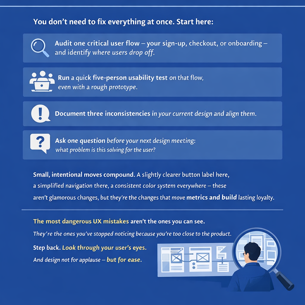
- Audit one critical user flow — your sign-up, checkout, or onboarding — and identify where users drop off.
- Run a quick five-person usability test on that flow, even with a rough prototype.
- Document three inconsistencies in your current design and align them.
- Ask one question before your next design meeting: what problem is this solving for the user?
Small, intentional moves compound. A slightly clearer button label here, a simplified navigation there, a consistent color system everywhere — these aren’t glamorous changes, but they’re the changes that move metrics and build lasting loyalty.
The most dangerous UX mistakes aren’t the ones you can see. They’re the ones you’ve stopped noticing because you’re too close to the product. Step back. Look through your user’s eyes. And design not for applause — but for ease.
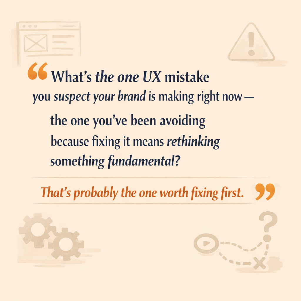
What’s the one UX mistake you suspect your brand is making right now — the one you’ve been avoiding because fixing it means rethinking something fundamental? That’s probably the one worth fixing first.
Comments
Post a Comment